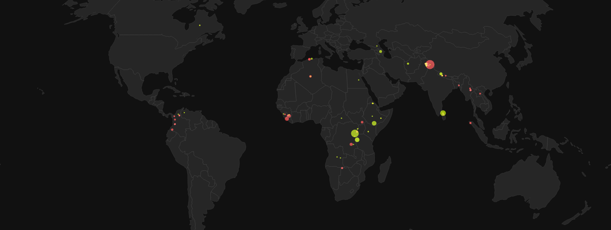
Animated map of armed conflict events worldwide since 2000 (UCDP GED data).
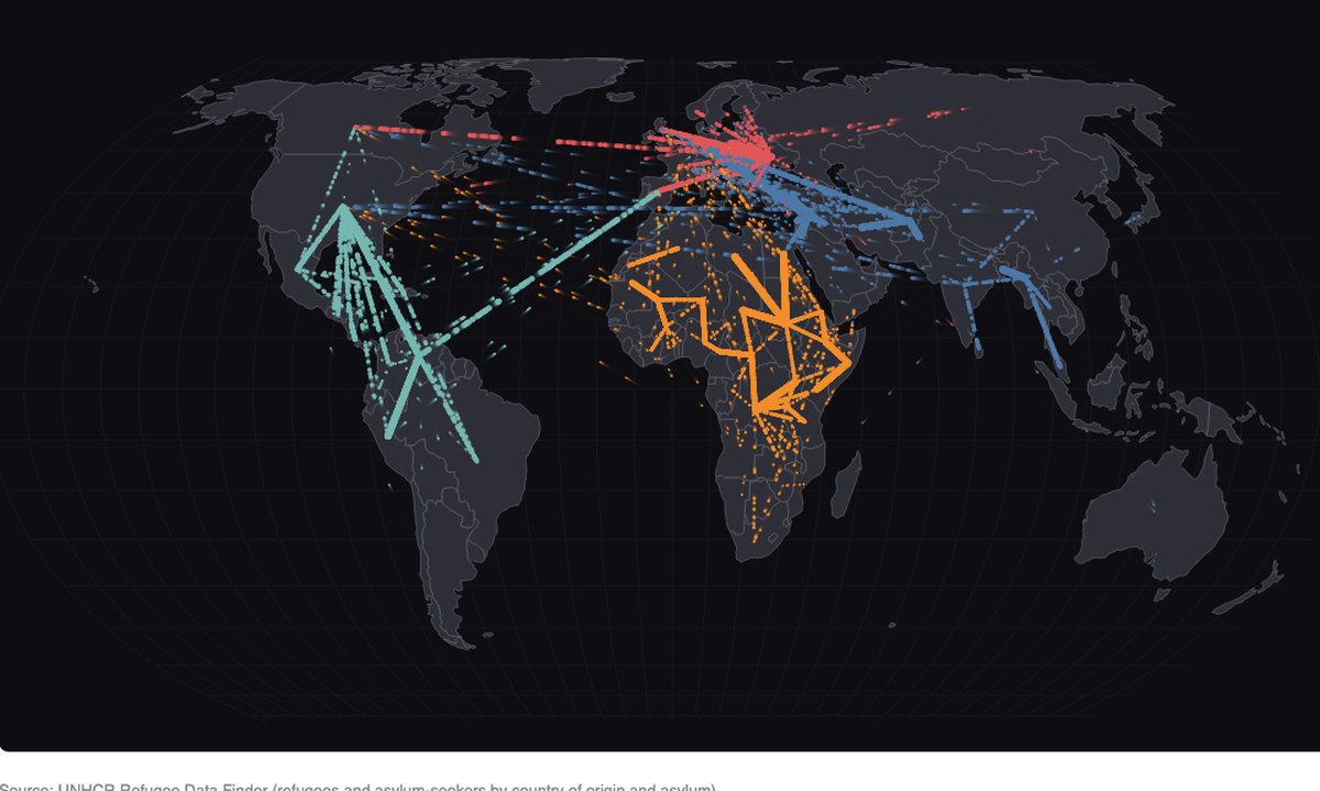
Animated map of refugee and asylum-seeker flows between countries of origin and asylum since 2000 (UNHCR), with a year slider.
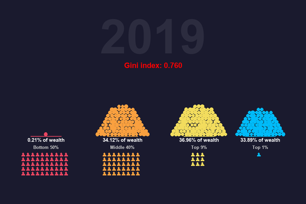
Falling grains of sand show how the share of national wealth held by the bottom 50%, middle 40%, top 9% and top 1% has shifted since 1962 (World Inequality Database).
A generative river of particles tracing 140 years of monthly global temperature anomalies (NASA GISTEMP).
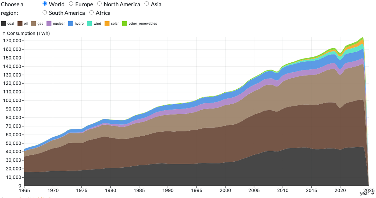
Energy consumption by source and region since 1965 (Our World in Data).
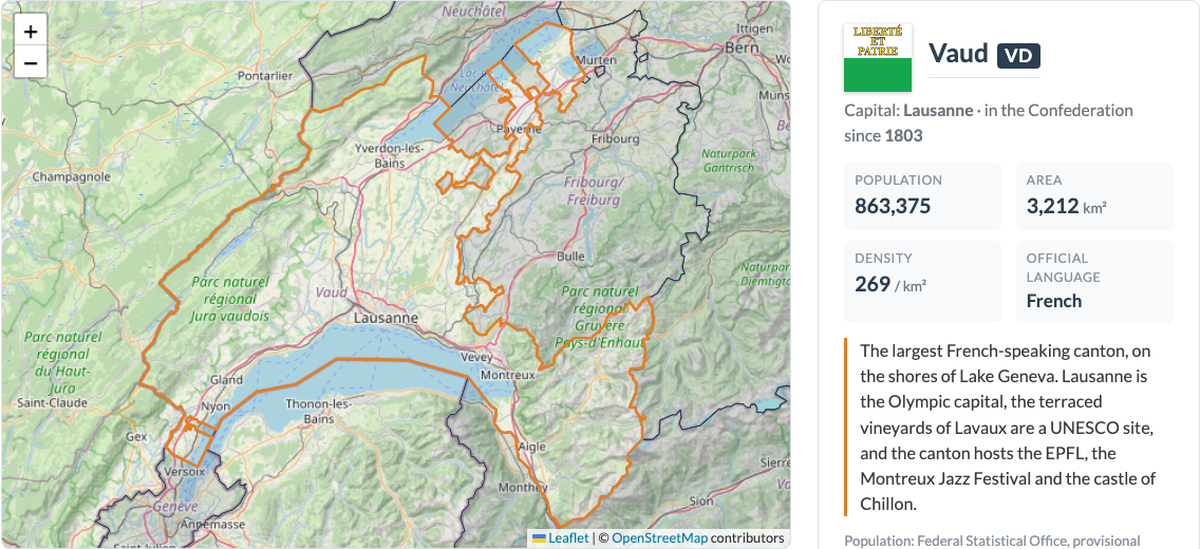
An interactive map of the 26 Swiss cantons. Click a canton to zoom in and read its key facts: coat of arms, capital, population, area, languages and what makes it special.
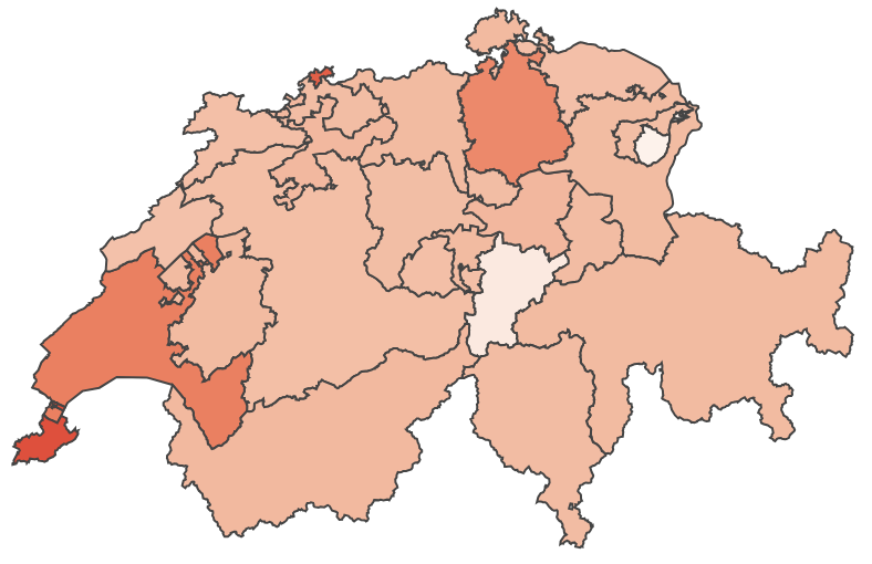
Choropleth map of the average monthly health insurance premium in each canton, with a year slider and auto-play.